 Softwavz
L
O
A
D
I
N
G
Softwavz



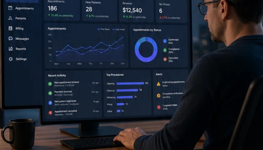
A dashboard nobody opens is a report nobody asked for.
Dashboards are usually specified by listing what data exists. That is why so many are abandoned within a month — they answer questions nobody was asking, on a screen that takes a minute to read.
The ones people keep open all day were designed backwards, from the decision.
For every dashboard, ask what someone will do differently after looking at it. If there is no answer, it is a report, and it belongs in an email once a week rather than on a screen.
A production supervisor decides what to run next and who to move. A clinic manager decides whether tomorrow is over-booked. Those decisions determine what the screen shows, and everything not serving them is noise competing for attention.
Almost nobody changes filters. Whatever loads by default is, in practice, the dashboard — so it should be the most common question, already answered, with no configuration.
If the useful view requires setting a date range and picking a site, most people will look once and not return.
Revenue of 4.2 lakh tells you nothing. Against last week, against target, against the same week last year — now it is information.
Every headline figure should carry a comparison, and the comparison should be the one that drives the decision. Against target for a manager; against last week for someone watching a trend.
People read a dashboard in seconds. The layout should let them see whether things are normal before they read a single label — sparklines, direction, and colour used sparingly enough that red actually means something.
If everything is highlighted, nothing is. Reserve emphasis for the cases needing action today.
The most common next question is always "which ones?". A dashboard that shows twelve overdue items and cannot list them forces a second tool, and that is where people give up.
Every aggregate should open the records behind it. This one change does more for adoption than any amount of chart styling.
State when the data was last updated, plainly. A figure that is four hours old is fine if people know it; the same figure is actively harmful if they assume it is live and make a staffing decision on it.
Trust is the whole product with operational dashboards. One wrong number, discovered once, and the screen is never opened again.
The operational dashboards in our nine products are built to these rules, and the same thinking is what Creative Studio applies when the reporting layer is the part users judge you on.
We build the systems behind this — nine of them, running in production. Book a 45-minute walkthrough and we will show you how it works against your own workflow, or tell you honestly if you do not need it yet.


